How to Select Wall Colors Based on Your Mood & Space
Choosing the right wall color can completely transform the atmosphere of a room, impacting both your mood and the way you feel in the space. Colors have a profound emotional influence, and picking the right shade is more than just following the latest trends; it should reflect your feelings, the room’s purpose, and how you use that space.
At Staadil Studio, we specialize in creating mood-perfect spaces tailored to your unique needs. As you dive into this guide, you’ll discover how to select wall colors that not only resonate with your emotions but also enhance the purpose of each room in your home.
Understanding Color Psychology
Color psychology is the study of how colors affect our feelings and behavior. Each color can evoke a particular mood or atmosphere, impacting our daily lives in various ways:
- Blue: Instills calmness and aids focus, making it perfect for spaces where concentration is key.
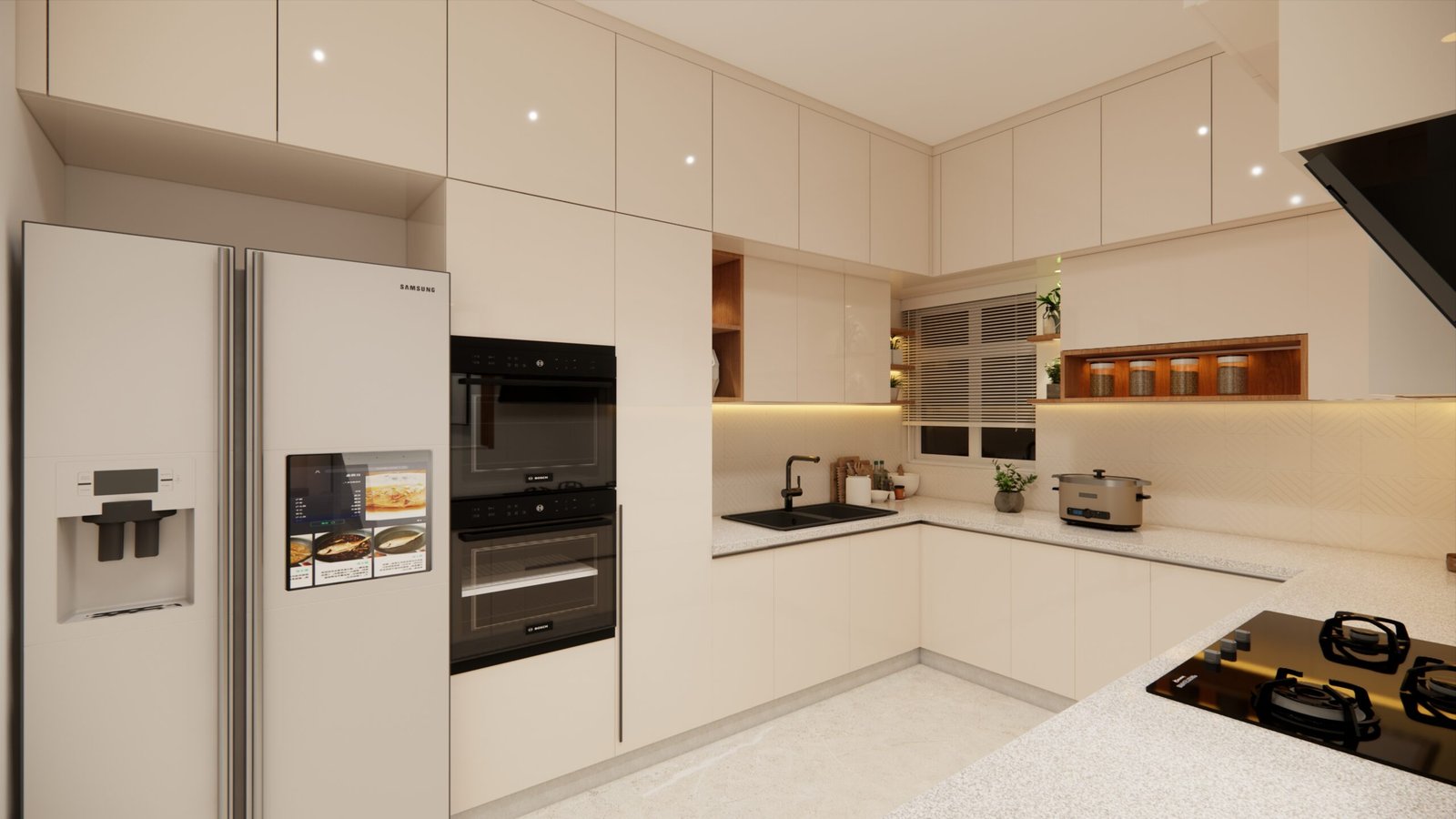
- Yellow: Radiates cheerfulness and energy, ideal for kitchens and playrooms.
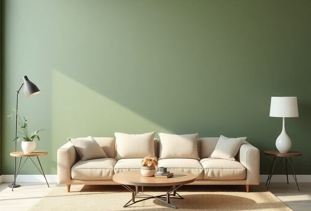
- Green: Represents balance and relaxation, a fitting choice for bedrooms and lounges.
- Red: Exudes passion and energy, often best in dynamic, social areas.
- Grey: Offers neutrality and a modern touch, great for minimalist decor.
- White: Conveys cleanliness and spaciousness, perfect for small or sunny rooms.
- Pink: Evokes softness and warmth, making it a lovely option for cozy bedrooms.
In Indian homes, cultural significance also influences color selection. For instance, certain shades are preferred during festivals for their auspicious qualities. Understanding color psychology can help you create spaces that are not only beautiful but also supportive of your emotional well-being.
Matching Mood with Function of the Room
When decorating your home, it’s crucial to match the mood you want to create with the function of each room. Here’s a quick guide on recommended moods and ideal colors for various spaces:
Room | Recommended Mood | Ideal Colors |
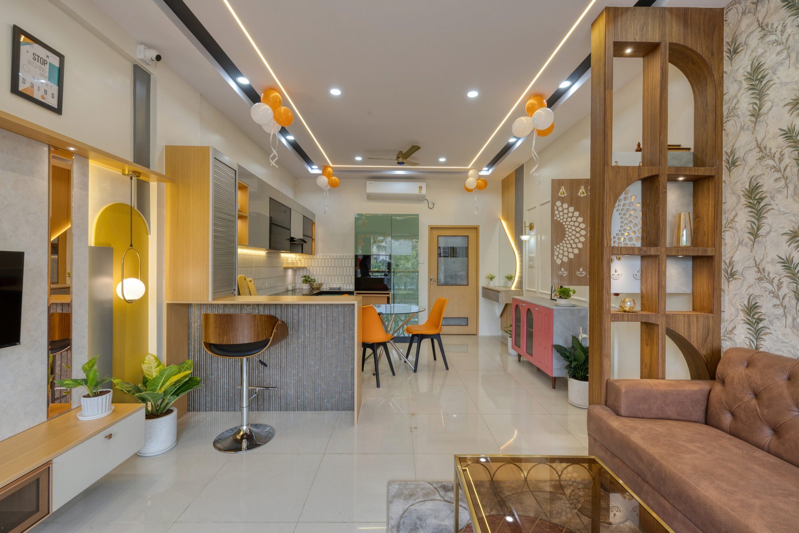
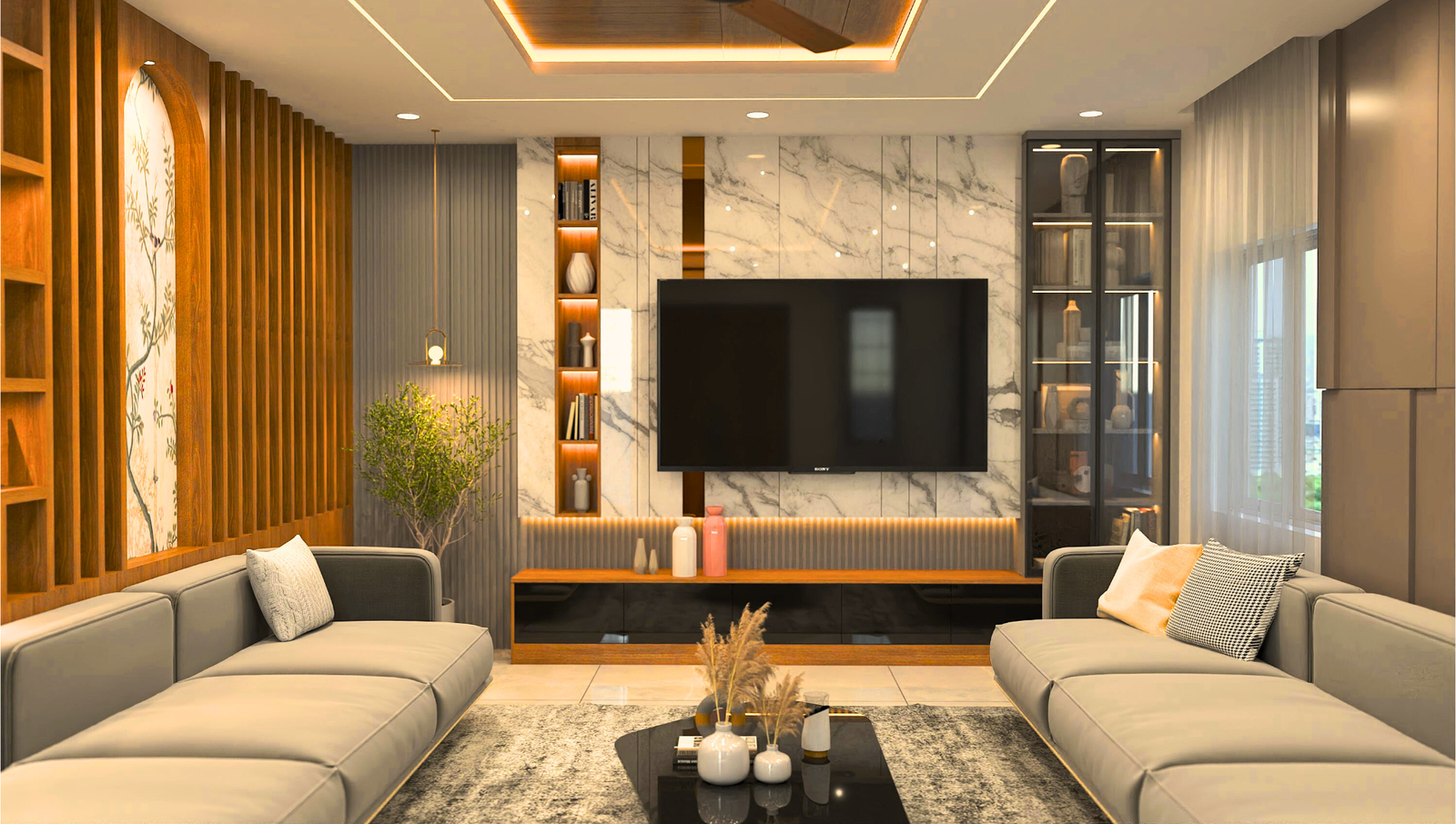
Living Room | Welcoming & Social | Beige, warm neutrals, green |
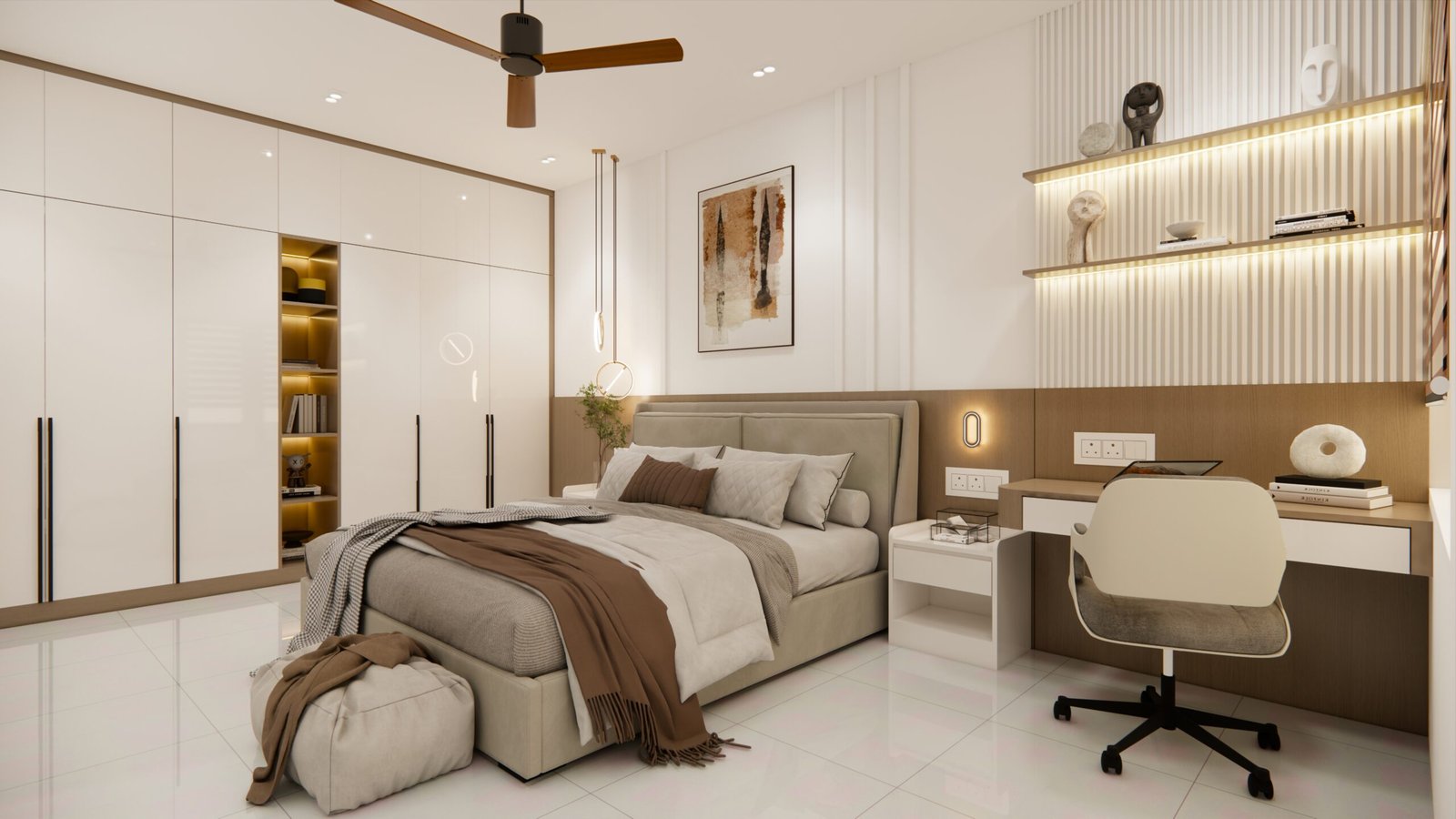
Bedroom | Calm & Relaxing | Light blue, lavender, blush |
Kitchen | Fresh & Energetic | Yellow, mint green |
Bathroom | Clean & Soothing | White, aqua, soft grey |
Study/Home Office | Focused & Quiet | Blue, off-white, pastel green |
Choosing the right color for each space enhances its purpose. A cozy living room with warm neutrals invites conversation, while a serene bedroom painted in soft blues promotes better sleep.
Wall Colors Based on Space Size and Natural Light
The size of a room and the amount of light it receives can significantly influence the colors you should select:
- Small Rooms: Light colors help create an illusion of space, making them feel bigger than they are. Shades like soft pastels or whites can brighten up a small area.
- Large Rooms: Don’t shy away from bold or darker tones; they can add character and warmth to expansive spaces.
- Rooms with Natural Light: Almost any color can work well here. If the room is flooded with light, deep hues can add depth without overwhelming the space.
- Rooms with Low Light: Warmer, lighter tones can help brighten up a dimly lit area. Soft yellows or cream colors are excellent choices.
Also, consider how your room faces. North-facing rooms can feel cooler, so warmer colors might be more inviting. South-facing rooms bask in natural light, making them flexible for a wider range of shades.
Color Pairing Tips from Staadil’s Designers
Mixing and matching colors can be a fun way to add personality to your spaces! Here are some tips from our talented designers at Staadil:
- Accent Wall Strategy: Create a focal point with an accent wall in a contrasting color.
- Contrast and Complementary Shades: Use colors that are opposite each other on the color wheel to create balance. Think of pairing soft blue with vibrant orange for an eye-catching combination.
- Safe Neutrals with Bold Décor: Neutral walls can serve as a fantastic backdrop for bold furniture and decorations. For example, combine off-white walls with a mustard yellow accent for a vibrant yet balanced vibe.
Experimenting with colors can make your home truly unique!
Paint Finish and Brand Recommendations
Finishes can affect how colors appear in different lights. Here are some options to consider:
- Matte: Great for hiding imperfections, but less durable.
- Satin: Offers a subtle sheen, easy to clean, and is perfect for living areas.
- Glossy: Very durable and easy to wipe down, ideal for high-traffic areas like kitchens.
In terms of brands, some reliable Indian options include Asian Paints, Nerolac, and Berger. Each brand has its strengths, so choose one that suits your needs best!
Conclusion
Selecting wall colors based on your mood and the purpose of each space is crucial to creating a harmonious home environment. By understanding color psychology and using practical tips, you can transform any room into a calming retreat or a vibrant gathering space.